Who Picked Up The Check?
Adventures in Data Exploration
In November 2012 the United States Postal Service reported a staggering deficit of $15.9 billion. For the historian, this begs the question: was it always this bad? Others have penned far more nuanced answers to this question, but my starting point is a lot less sophisticated: a table of yearly expenses and income.
 US Postal Department Surplus (Gray) or Deficit (Red) by Year
So, was the postal department always in such terrible fiscal shape? No, not at first. But from the 1840s onward, putting aside the 1990s and early 2000s, deficits were the norm. The next question: What was the geography of deficits? Which states paid more than others? Essentially, who picked up the check?
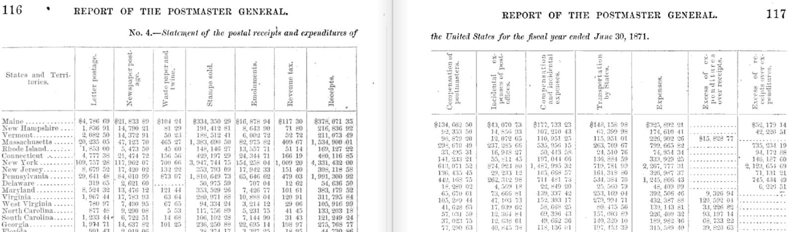
Every year the Postmaster General issued a report containing a table of receipts and revenues broken down by state. Let’s take a look at 1871:
 1871 Annual Report of the Postmaster General - Receipts and Expenditures
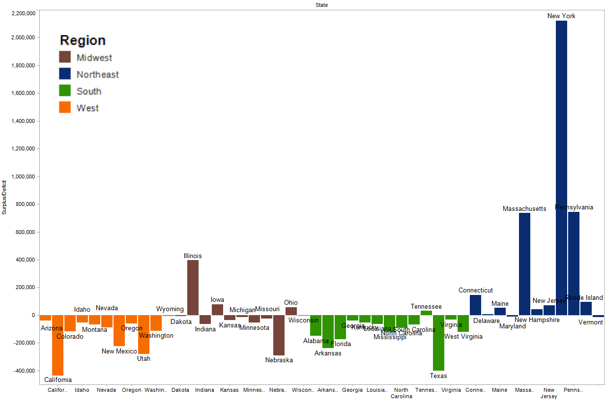
Because it’s only one table, I manually transcribed the columns into a spreadsheet. At this point, I could turn to ArcGIS to start analyzing the data, maybe merging the table with a shapefile of state boundaries provided by NHGIS. But ArcGIS is a relatively high-powered tool better geared for sophisticated geospatial analysis. What I’m doing doesn’t require all that much horsepower. And, in fact, quantitative spatial relationships (ex. measurements of distance or area) aren’t all that important for answering the questions I’ve posed. There are a number of different software packages for exploring data, but Tableau provides a quick-and-dirty, drag-and-drop interface. In keeping with the nature of data exploration, I’ve purposefully left the following visualizations rough around the edges. Below is a bar graph, for instance, showing the surplus or deficit of each state, grouped into rough geographic regions:
 Postal Surplus or Deficit by State - 1871
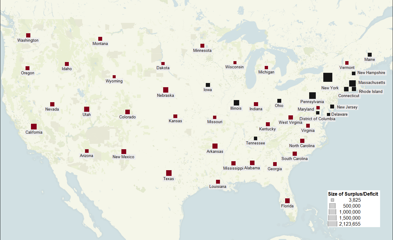
Or, in map form:
 Postal Surplus (Black) or Deficit (Red) by State - 1871
Between the map and the bar graph, it’s immediately apparent that: a) Most states ran a deficit in 1871 b) The Northeast was the only region that emerged with a surplus
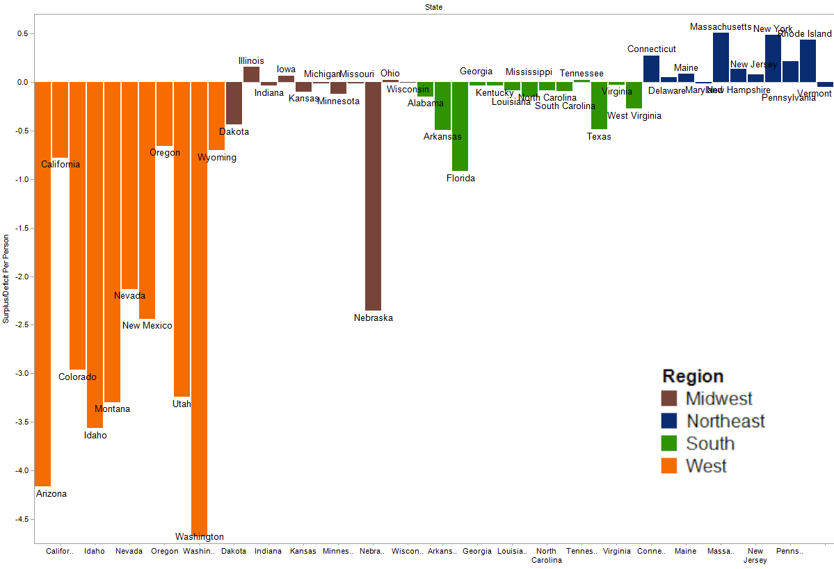
So who picked up the check? States with large urban, literate populations: New York, Pennsylvania, Massachusetts, Illinois. Who skipped out on the bill? The South and the West. But these are absolute figures. Maybe Texas and California simply spent more money than Arizona and Idaho because they had more people. So let’s normalize our data by analyzing it on a per-capita basis, using census data from 1870.
 Postal Surplus or Deficit per Person by State - 1871
The South and the West may have both skipped out on the bill, but it was the West that ordered prime rib and lobster before it left the table. Relative to the number of its inhabitants, western states bled the system dry. A new question emerges: how? What was causing this extreme imbalance of receipts and expenditures in the West? Were westerners simply not paying into the system?
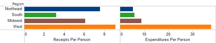 Postal Receipts and Expenditures per Person by Region - 1871
Actually, no. The story was a bit more complicated. On a per-capita basis, westerners were paying slightly more money into the system than any other region. The problem was that providing service to each of those westerners cost substantially more than in any other region: $38 per person, or roughly 4-5 times the cost of service in the east. For all of its lore of rugged individualism and a mistrust of big government, the West received the most bloated government “hand-out” of any region in the country. This point has been driven home by a generation of “New Western” historians who demonstrated the region’s dependence on the federal government, ranging from massive railroad subsidies to the U.S. Army’s forcible removal of Indians and the opening of their lands to western settlers. Add the postal service to that long list of federal largesse in the West.
But what made mail service in the West so expensive? The original 1871 table further breaks down expenses by category (postmaster salaries, equipment, buildings, etc.). Some more mucking around in the data reveals a particular kind of expense that dominated the western mail system: transportation.
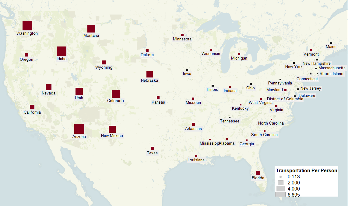 Transportation Expenses per Person by State (State surplus in black, deficit in red) - 1871
High transport costs were partially a function of population density. Many western states like Idaho or Montana consisted of small, isolated communities connected by long mail routes. But there’s more to the story. Beginning in the 1870s, a series of scandals wracked the postal department over its “star” routes (designated as any non-steamboat, non-railroad mail route). A handful of “star” route carriers routinely inflated their contracts and defrauded the government of millions of dollars. These scandals culminated in the criminal trial of high-level postal officials, contractors, and a former United States Senator. In 1881, the New York Times printed a list of the ninety-three routes under investigation for fraud. Every single one of these routes lay west of the Mississippi.
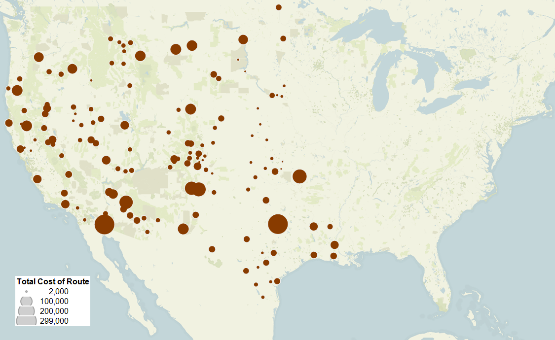 Annual Cost of "Star" Routes Under Investigation for Fraud - 1881 (Locations of Route Start/End Termini)
The rest of the country wasn’t just subsidizing the West. It was subsidizing a regional communications system steeped in fraud and corruption. The original question - “Who picked up the check?” - leads to a final cliffhanger: why did all of these frauds occur in the West?