Map of Early Modern London
I'm glad to see the Map of Early Modern London is getting a fair amount of coverage. Spearheaded by Janelle Jenstad at the University of Victoria, the project "maps the streets, sites, and significant boundaries of late sixteenth-century and early seventeenth-century London. You will see many of the theatres and landmarks of Shakespeare's time, and learn about the history and culture of the city in which he lived and worked." In order to do so, they have created two interfaces of the Agas map of London. One is an old-school format of breaking the map into a basic grid with 32 boxes - clicking on one zooms in to that section and shows starred points of interest, such as taverns, theaters, etc. Hovering your mouse over the star gives you the name, and clicking on it takes you to more information about the location. This format is okay, but limited. For someone who has become completely accustomed to GoogleMaps, it is frustrating not having the quick and easy control of zooming in and out, panning, or finding information while remaining "in" the map.
They attempted to address this with an experimental map, which has a much more complex and interactive interface:
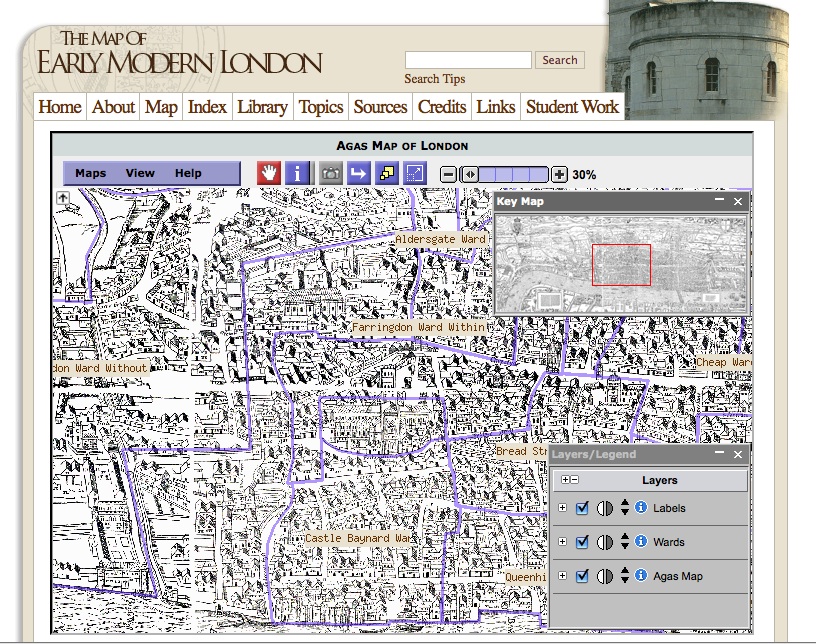
This really puts you in the driver's seat in determining how you want it to appear, maneuvering through the map, and accessing its information. Jenstad designed the project as a pedagogical tool, and I think it would work really well for the classroom. It allows students to find information while also exploring the city and being able to observe geographical patterns or relationships. Interesting assignments could be looking for patterns in establishments, comparing and contrasting different wards and their contents, or designing a "walking tour" based on a theme of their choosing. I wish they would also make it possible to create a mash-up that incorporates present-day multimedia, such as clicking on a location and having a photograph or video appear.
The site does have its share of bugs and problems - broken links, buttons that disappear or don't do anything, etc. Maneuvering within the map (even the experimental one) still feels kind of clunky. This is a general problem with interactive maps that aren't based off an already-existing structure (such as GoogleMaps, ArcMap, etc.) Independently created maps can often seem amateur in comparison to standard, powerful formats we are used to utilizing. Nevertheless, I admire the project and the way it was carried out. It is immensely collaborative, with a long list of student contributors, and general guidelines for contributing information and plans to create an editorial board that will use a "refereeing process" of evaluation.