American Panorama: Part I
I recently wrote about the wave of digital history reviews currently washing over print journals like the American Historical Review, The Western Historical Quarterly, and The Journal of American History. This wave brings into focus the odd reticence of digital historians to substantively review digital history projects in open, online venues. I ended the post with a call for the field to more actively engage with the work of our peers and, in particular, to evaluate the historical contributions of these digital projects if and when they fall within our areas of subject expertise. The following is my attempt to do just that.

American Panorama: An Atlas of United States History was released in December 2015 by the University of Richmond’s Digital Scholarship Lab. It is a collection of four map-based visualizations focusing on different topics in American history: slave migration, immigration to the U.S., canal construction, and the Overland Trails. Each of these visualizations revolve around an interactive map, with surrounding panes of charts, timelines, contextual data, and primary sources related to the topic. If I could summarize the project’s historical contributions in a single sentence, it would be this one: American Panorama incorporates movement into the history of the United States. To be even more specific, the project shines a new light on the historical movement of people. Its three most compelling visualizations (foreign immigration, slave migration, and the Overland Trails) illustrate some of the most monumental shifts of people in American history. There are certainly other episodes of travel and migration worth studying - Indian Removal or the Great Migration immediately jump to mind - but those selected by American Panorama are certainly three of the most consequential.
Like most digital history projects, American Panorama is a collaboration. Unlike most digital history projects, it’s a collaboration between academic historians and a private company. The Digital Scholarship Lab’s Robert Nelson, Ed Ayers, Scott Nesbit (now at the University of Georgia), Justin Madron, and Nathaniel Ayers make up the academic half of the project. The private half of the partnership is Stamen Design, a renowned data visualization and design studio that has worked with clients ranging from Toyota and AirBnB to the U.S. Agency for International Development. Stamen is also, in the words of tech journalist Alexis Madrigal, “perhaps the leading creator of cool-looking maps.” Stamen’s fingerprints are all over American Panorama. The visualizations are beautifully structured, deeply immersive, and packed with information. In fact, data depth and data density are the hallmarks of these visualizations - I don’t think I’ve ever seen this much historical content visualized in this many different ways, all within a single browser window. Furthermore, the project’s visual interface presents a new and valuable framework to understand the scale of people movements in a way that written narratives can struggle to convey. Writing about thousands or even millions of people moving around over the course of years and decades can often devolve into an abstract swirl of numbers, states, regions, and dates. American Panorama makes that swirl intelligible.
The project encapsulates many of the current hallmarks of digital history. It is aimed at a broad public audience and was “designed for anyone with an interest in American history or a love of maps.” Relatedly, the project is exploratory and descriptive rather than explicitly interpretive, and offers only hints at how the reader should understand and interpret patterns. Outside of brief and rather modest textual asides, readers are largely left to make their own discoveries, construct their own narratives, and draw their own conclusions. The common justification for creating exploratory visualizations rather than argumentative or narrative-driven ones is that they encourage participatory engagement. Empowering readers to control how they interact with a visualization nudges them to delve deeper into the project and emerge with a richer understanding of the topic. But an exploratory framework hinges on a reader’s abilities and willingness to discover, narrate, and interpret the project for themselves.
To take one example, American Panorama’s Foreign-Born Population, 1850-2010 offers by far the strongest interpretive stance out of the project’s four visualizations: “American history can never be understood by just looking within its borders.” Even so, the creators consign their interpretation to a short, solitary paragraph in the About This Map section, leaving readers to draw their own conclusions about the meaning and implications of this message. The tech blog Gizmodo, for instance, covered the project’s release under the headline: “See The US Welcome Millions Of Immigrants Over 150 Years In This Interactive Map.” Internet headlines have never exactly been a bastion of nuance, but to say that the U.S. “welcomed” immigrants is, well, not very accurate. It’s also an example of the kind of historical mischaracterization that can arise when projects push authorial interpretation into the background.
Full disclosure: I know and deeply admire the work of Rob Nelson, Scott Nesbit, and Ed Ayers. They are very, very smart historians, which is why I found myself wanting to hear more of their voices. What new patterns have they discovered? What stories and interpretations have they drawn from these patterns? How has the project changed their understanding of these topics? The creators of American Panorama do not answer these questions explicitly. Instead, they allow patterns, stories, and interpretations to swim just beneath the surface. This was likely a deliberate choice, and I don’t want to critique the project for failing to accomplish something that it never set out to do in the first place. American Panorama is not an academic monograph and it shouldn’t be treated as one. Nevertheless, the project left me hungry for a more explicit discussion of how it interpretation and historical literature.
I’d like to offer my own take on American Panorama using equal parts review and riff, one that combines an evaluation of the project’s strengths and weaknesses with a discussion of how it fits into themes and topics in U.S. history. To do so, I’ve focused on two visualizations: The Forced Migration of Enslaved People, 1810-1860 and The Overland Trails. Fair warning: in true academic fashion, I had far too much to say about the two visualizations, so I split the piece into two separate posts. The first is below, and the second will follow soon. (Update: you can read Part II here.)
Part I. The Forced Migration of Enslaved People, 1810-1860
In some ways, Americans remember slavery through the lens of movement. This begins with The Middle Passage, the horrifying transportation of millions of human beings from Africa to the Americas. The focus on movement then shifts to escape, perhaps best embodied in the Underground Railroad and its stirring biblical exodus from bondage to freedom. But there was a much darker, and less familiar, counterweight to the Underground Railroad: being “sold down the river” to new planting frontiers in the Deep South. The sheer volume of this movement dwarfed the far smaller trickle of runaways: between 1810 and 1860 southern planters and slave traders forced nearly one million enslaved people to move southward and westward. The Forced Migration of Enslaved People, 1810-1860 helps us understand the scale and trajectory of this mass movement of human beings.
The visualization uses a map and timeline to illustrate a clear decade-by-decade pattern: enslaved people streaming out of the Upper South and the eastern seaboard and into the cotton-growing regions of the Black Belt (western Georgia, Alabama, and Mississippi), the Mississippi River Valley, and eastern Texas and Arkansas. It shows that this shift was not uninterrupted, but came in fits and starts. The reverberations of the 1837 financial panic, for instance, dampened and diffused this movement during the 1840s. An accompanying data pane charts the in-migration and out-migration on a state and county level: during the 1830s more than 120,000 slaves left Virginia, even as 108,000 slaves streamed into Alabama. None of these findings are especially new for historians of the period, but The Forced Migration of Enslaved People brings them into sharp focus.
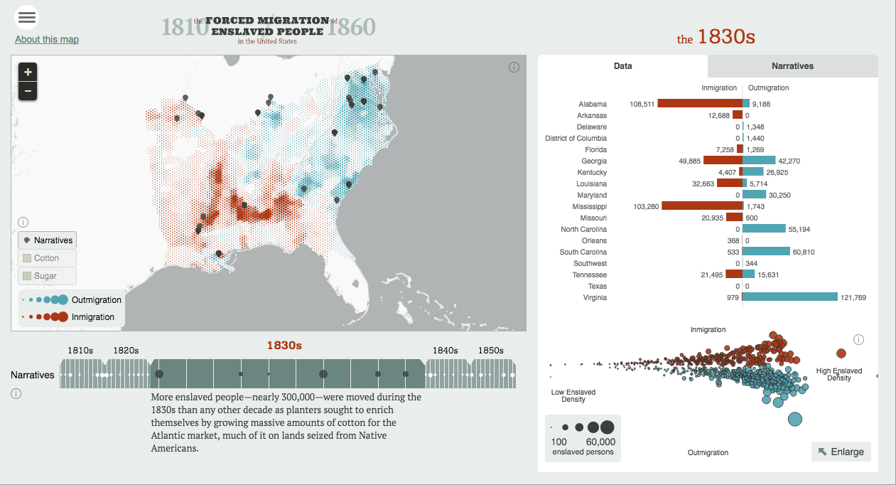
On an interpretive level, The Forced Migration of Enslaved People helps reorient the locus of American slavery away from The Plantation and towards The Slave Market. This is part of a larger historiographical pivot, one that can be seen in Walter Johnson’s book Soul by Soul (1999). Johnson reminds us that American slavery depended not just on the coerced labor of black bodies, but on the commodification of those same bodies. It wasn’t enough to force people to work; the system depended first and foremost on the ability to buy and sell human beings. Because of this, Johnson argues that the primary sites of American slavery were slave markets in places like Charleston, Natchez, and New Orleans. Soul by Soul was an early landmark in the now flourishing body of literature exploring the relationship between slavery and capitalism. The book’s argument rested in large part on the underlying mass movement of black men, women, and children, both through slave markets and into the expanding planter frontier of the Southwest. American Panorama lays bare the full geography of this movement in all of its spatial and temporal detail.
There is a certain irony in using Walter Johnson’s Soul by Soul to discuss The Forced Migration of Enslaved People. After all, Johnson’s book includes a critique that might as well have been addressed directly to the project’s creators. He bluntly asserts that the use of maps and charts to illustrate the slave trade hides the lives and experience of the individuals that made up these aggregated patterns. Instead, Johnson calls for the kind of history “where broad trends and abstract totalities thickened into human shape.” (8) His critique echoes the debates that swirled around Robert Fogel and Stanley Engerman’s Time on the Cross (1974) and continue to swirl around the digital project Voyages: The Trans-Atlantic Slave Trade Database.
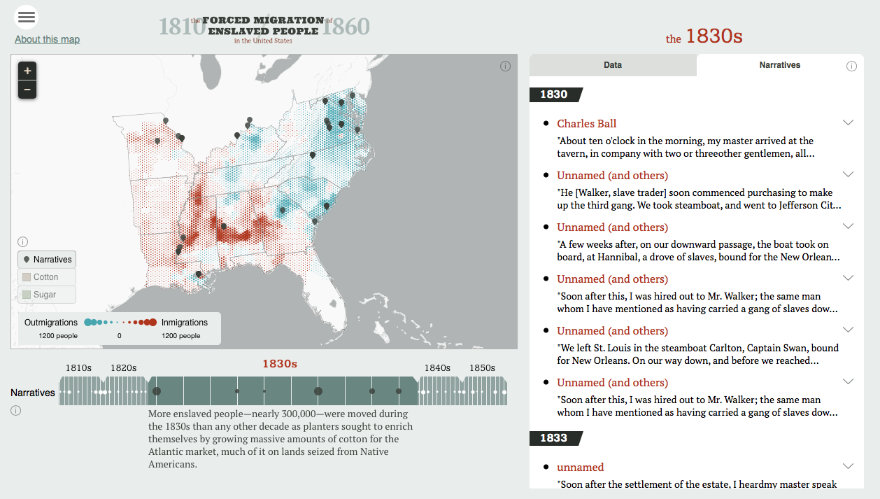
The creators of The Forced Migration of Enslaved People gesture towards the larger historiographical divide between quantification and dehumanization in an accompanying text: “Enslaved people’s accounts of the slave trade powerfully testify to experiences that cannot be represented on a map or in a chart.” Instead, they attempt to bring these two modes of history together by incorporating excerpted slave narratives alongside its maps and charts. Clicking on icons embedded in the map or the timeline reveals quotes from individual accounts that mention some dimension of the slave trade. This interface allows the reader to shift back and forth between the visual language of bars, dots, and hexbins, and the written words of formerly enslaved people themselves. The Forced Migration of Enslaved People uses a digital medium to present both the “broad trends and abstract totalities” and the “human shape” of individual lives. One of the analytical and narrative payoffs of an interactive interface is the ability to seamlessly move between vastly different scales of reading. The Forced Migration of Enslaved People breaks important new ground in this regard by blending the macro scale of demographics with the micro scale of individuals.
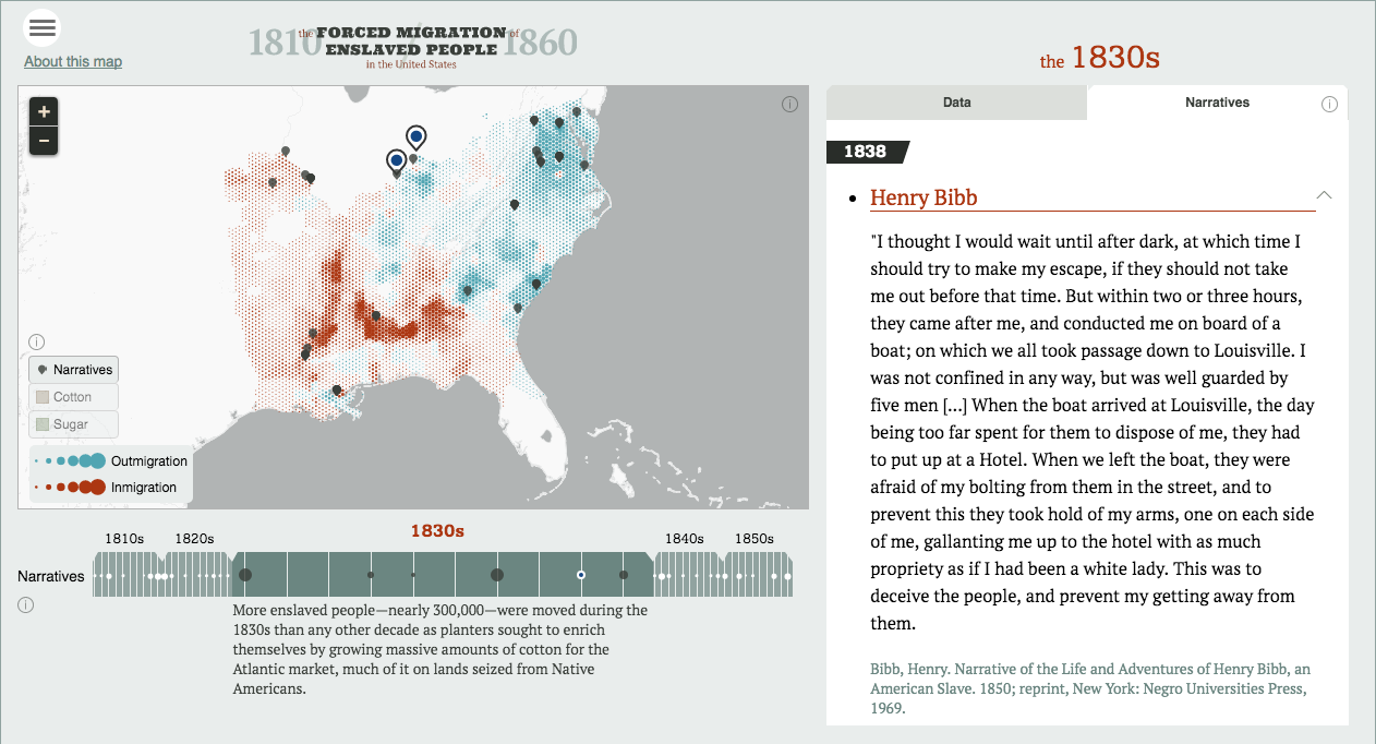
Ultimately, however, the project’s attempt to combine narrative accounts and quantitative data falls short of its potential. On the whole, the scale of the individuals recedes under the scale of the data. The problem lies in the way in which the project presents its excerpted quotes. Flurries of names, places, events, and emotions appear divorced from the broader context of a particular narrative. Reading these text fragments can often feel like driving past a crash on the side of a highway. You might glimpse the faces of some passengers or the severity of the wreck, but you don’t know how they got there or what happens to them next. Then you pass another crash. And another. And another. The cumulative weight of all these dozens of wrecks is undeniable, and part of what makes the visualization effective. But it’s also numbing. Human stories begin to resemble data points, presented in chronological, bulleted lists and physically collapsed into two-line previews. The very features that make narratives by enslaved people such powerful historical sources - detail, depth, emotional connection - fade away within this interface. Narratives give voice to the millions of individuals whose stories we’ll never hear; The Forced Migration of Enslaved People helps us to hear some of those voices, but only briefly, and only in passing.
Historians characterize the years leading up to the Civil War as a period defined by sectional conflict between North and South. The abolition of slavery was not the major flashpoint for this conflict; rather, the expansion of slavery into western states and territories was the primary wedge between the two sides. The issue would come to define national politics by pitting two competing visions of the nation against one another. The Forced Migration of Enslaved People reminds us that this was not just an ideological or political issue, but a spatial issue rooted in the physical movement of hundreds of thousands of people into areas like the Black Belt and the Mississippi River Vally. By the 1850s, many northerners feared that this great heave of slaveholders and enslaved people would continue onwards into the Far West. The Forced Migration of Enslaved People forces us to take those fears seriously. What if the visualization’s red hexbins didn’t stop in the cotton fields of eastern Texas? What if its timeline didn’t end in 1860? Southern slavery did not stand still during the antebellum era and its demise was far from inevitable. This visualization gives us a framework with which to understand that trajectory.
I doubt that most Americans would put slave traders and shackled black bodies within the historical pantheon of great national migrations, but American Panorama injects this vast movement of people into the history of the antebellum United States. In the second part of my discussion, I’ll turn my attention to a much more familiar historical migration unfolding at the same time: The Overland Trails.